Tax Harvesting Plan

Helping mutual fund investors to reduce tax by booking losses/gains

My ROLE

Sole Designer

Time

3 weeks

Status

Live

Tax Harvesting Plan

Helping mutual fund investors to reduce tax by booking losses/gains

My ROLE

Sole Designer

Time

3 weeks

Status

Live

Context

PowerUp Money helps Indian investors choose and manage mutual funds. Revenue comes from Elite membership — and to grow it, we needed features that gave users a reason to upgrade. Tax harvesting feature was selected as no app in the market was doing it.

Problem

In India, you pay tax on the gains you book when you withdraw from a fund. Short-term and long-term gains are taxed differently — but you can lower the bill by booking losses to offset gains. On top of that, long-term gains up to ₹1.25L are tax-free each year, saving up to ₹15,625.


Most people don't know any of this, and the ones who do can't easily tell which funds to act on. We wanted to do that math for them — show exactly what they owe, and exactly which funds to withdraw from to owe less.

Goal

User goal: Make user understand how much exactly their tax is, how taxation works, what they can do about it to reduce it.


Business goal: To convert free user into paid Elite user.

Process
I wanted to answer "why is this happening" and "what can I do about it" in the same place. It started as a tax planner — a March-only tool. But a planner only matters for a few weeks a year. So we pivoted to a tracker + planner: something users check year-round, that answers three questions —

  • How much withdrawals have I made? Show the total gains so far and whether they're short-term or long-term (it affects your tax rate).

  • How much tax will I owe as of today?

  • Should I do anything? In March, show them which funds to sell to reduce taxes or how much they can book harvest gains with zero tax.

I wanted to answer "why is this happening" and "what can I do about it" in the same place. It started as a tax planner — a March-only tool. But a planner only matters for a few weeks a year. So we pivoted to a tracker + planner: something users check year-round, that answers three questions —

  • How much withdrawals have I made? Show the total gains so far and whether they're short-term or long-term (it affects your tax rate).

  • How much tax will I owe as of today?

  • Should I do anything? In March, show them which funds to sell to reduce taxes or how much they can book harvest gains with zero tax.

Approach 1 – With different page for long-term & short-term plan

Approach 2 – Added a capital gains summary to fill the gap

Final Solutions

A. Tax summary page / L0

After multiple quick iterations, stakeholders alignment and user-testing on floor I finalised this version. It solves for how much they've withdrawn, how much tax they owe, and what their options are in cleanest possible way.

After multiple quick iterations, stakeholders alignment and user-testing on floor I finalised this version. It solves for how much they've withdrawn, how much tax they owe, and what their options are in cleanest possible way.

After multiple quick iterations, stakeholders alignment and user-testing on floor I finalised this version. It solves for how much they've withdrawn, how much tax they owe, and what their options are in cleanest possible way.

B. Tax Saving Plan / L1

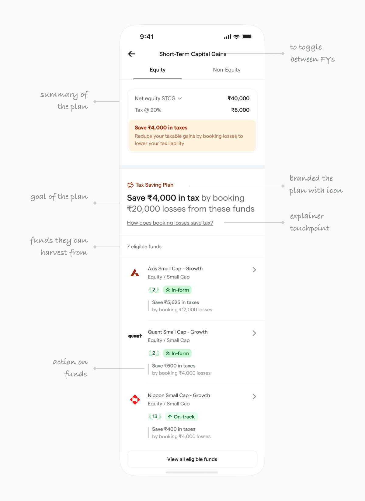
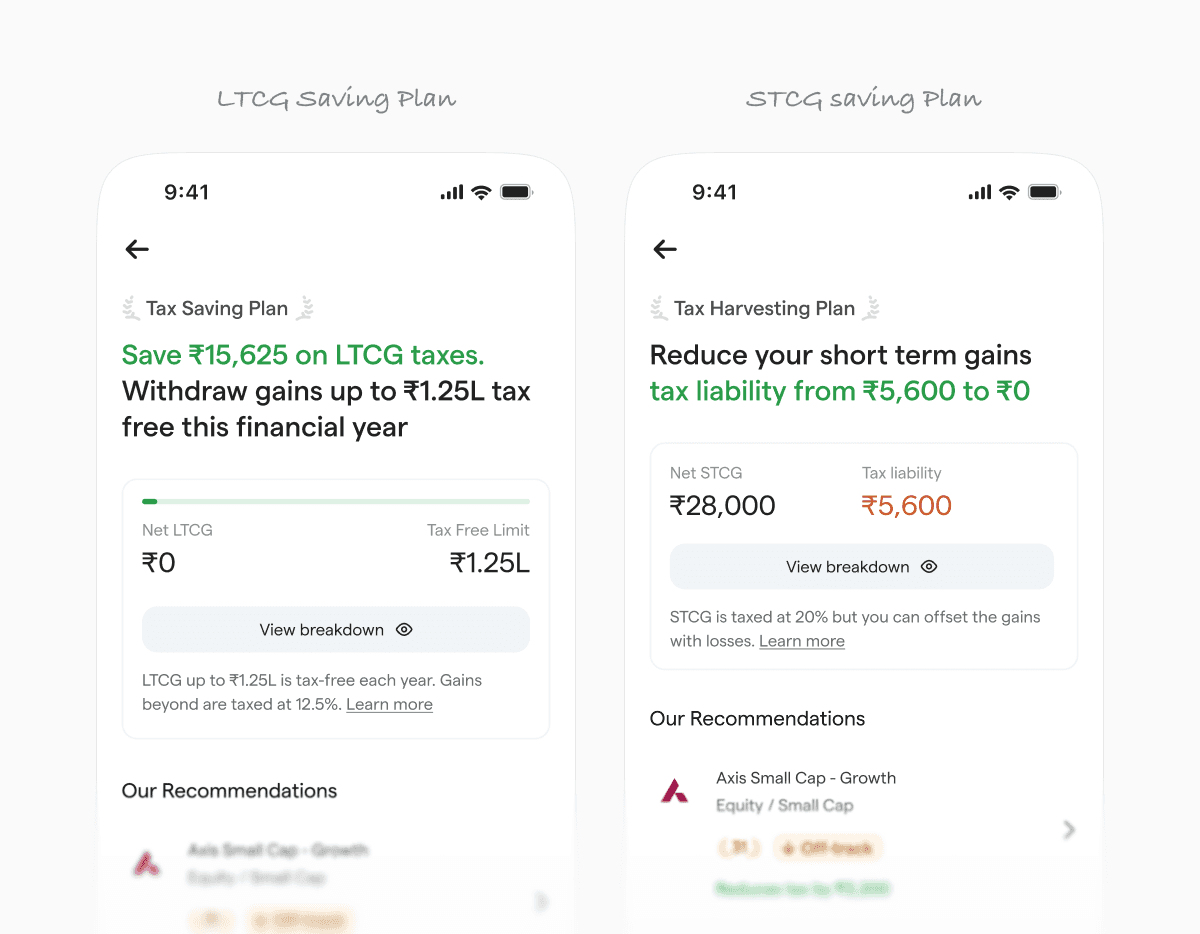
Separate plans for LTCG and STCG because the tax rules — and therefore the actions — are completely different. LTCG uses the ₹1.25L exemption. STCG offsets gains against losses. Each plan shows exactly how much can be saved and from which funds.

Separate plans for LTCG and STCG because the tax rules — and therefore the actions — are completely different. LTCG uses the ₹1.25L exemption. STCG offsets gains against losses. Each plan shows exactly how much can be saved and from which funds.

Separate plans for LTCG and STCG because the tax rules — and therefore the actions — are completely different. LTCG uses the ₹1.25L exemption. STCG offsets gains against losses. Each plan shows exactly how much can be saved and from which funds.

How it scales for different situations across short-term and long-term plans.

How it scales for different situations across short-term and long-term plans.

How it scales for different situations across short-term and long-term plans.

C. Fund Level Actions / L2

The most detailed layer — exact withdrawal amounts, broken down by folio and app. A reinvestment step comes immediately after, because selling without reinvesting defeats the purpose. The reinvestment logic accounts for fund performance, regular vs direct plans, and the app's existing recommendations.

The most detailed layer — exact withdrawal amounts, broken down by folio and app. A reinvestment step comes immediately after, because selling without reinvesting defeats the purpose. The reinvestment logic accounts for fund performance, regular vs direct plans, and the app's existing recommendations.

The most detailed layer — exact withdrawal amounts, broken down by folio and app. A reinvestment step comes immediately after, because selling without reinvesting defeats the purpose. The reinvestment logic accounts for fund performance, regular vs direct plans, and the app's existing recommendations.

Re-investment logic accounts for fund performance and regular vs direct plan and other already existing advices on the app.

Every screen was built to hand-hold. The target user files their own taxes but isn't a CA. Each decision is explained, not just shown.

Post Launch

A. Advance Tax

Users with tax liability above ₹10,000 are legally required to pay in quarterly instalments. Nobody knew this. We added quarterly due-date reminders and a simple mark-as-paid tracker inside the dashboard.

Users with tax liability above ₹10,000 are legally required to pay in quarterly instalments. Nobody knew this. We added quarterly due-date reminders and a simple mark-as-paid tracker inside the dashboard.

Users with tax liability above ₹10,000 are legally required to pay in quarterly instalments. Nobody knew this. We added quarterly due-date reminders and a simple mark-as-paid tracker inside the dashboard.

Different directions of the tax widget

Added a history view which shows past payments and current (if any).

Added a history view which shows past payments and current (if any).

Added a history view which shows past payments and current (if any).

Advance Tax History

2. Tax Payment (coming soon)

The next step: direct payment from inside the app, removing the need to navigate to the IT portal. Both came from the user insights: users trusted the dashboard enough to want to complete the whole tax workflow inside it.

The next step: direct payment from inside the app, removing the need to navigate to the IT portal. Both came from the user insights: users trusted the dashboard enough to want to complete the whole tax workflow inside it.

The next step: direct payment from inside the app, removing the need to navigate to the IT portal. Both came from the user insights: users trusted the dashboard enough to want to complete the whole tax workflow inside it.

Impact of the project

In March 2026 — the peak selling moment — the tax tracker helped convert 4,000 free users to Elite. Users who engaged with the tax tracker were 25% more likely to upgrade. Understanding their own portfolio that deeply is what made expert guidance feel worth paying for.

In March 2026 — the peak selling moment — the tax tracker helped convert 4,000 free users to Elite. Users who engaged with the tax tracker were 25% more likely to upgrade. Understanding their own portfolio that deeply is what made expert guidance feel worth paying for.

+0%TAX SUMMARY VISITS (L0)
+0%ELITE CTA CLICKS
+0%ELITES CONVERSION

User feedbacks on Tax Harvesting feature

What I learned

If we'd shipped a product solution, nobody would have opened it the rest of the year. Thinking about the whole experience and problem at depth forced us to design something people actually kept coming back to.

No reference points meant no shortcuts. Every screen had to justify itself — what does the user need to understand here, and what's the simplest way to show it.

If we'd shipped a product solution, nobody would have opened it the rest of the year. Thinking about the whole experience and problem at depth forced us to design something people actually kept coming back to.

No reference points meant no shortcuts. Every screen had to justify itself — what does the user need to understand here, and what's the simplest way to show it.

If we'd shipped a product solution, nobody would have opened it the rest of the year. Thinking about the whole experience and problem at depth forced us to design something people actually kept coming back to.

No reference points meant no shortcuts. Every screen had to justify itself — what does the user need to understand here, and what's the simplest way to show it.